YORK PLUS DEVELOPMENT
Website Design & SEO | Branding System | Social Media
York Plus Development Company Is A New Entrant In The Construction Services Sector, Offering Services Such As Maintenance And Sales Of Construction Equipment.
They Wanted The Brand Sense To Encompass All Construction Services, With Blue And Red Serving As The Main Colors In The Designs, As Well As A Strong Application Of The Brand Messaging So That Customers Can Quickly Comprehend The Company’s Services.
Building A Brand Is Difficult, And We Are Committed To Using Our Expertise And Professional Team To Create A Full-Fledged Brand.
Details
See how Looks like our services
Client
Industry
Our Role

Location
WEBSITE DESIGN FOR YORK PLUS DEVELOPMENT
as you can see both versions of desktop & mobile versions of Design a responsive E-commerce website.
Also, prepare all Images & Files for SEO and In-Bound SEO Plus Add company profile to Google and other search websites.
The Goal was to create something for both Industrial and commercial
We face designing a system for selling industrial materials such as electrical, drywall, floor materials &, etc. On the other hand, they have some services such as installing home staff or set up a place for specific uses.
By clicking link below you can see their website.
Branding System
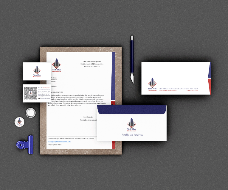
we like to share with you some of the branding component for ypd company to see how beautiful is they harmonic
Logo Design
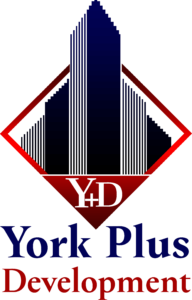
The was created for a Luxury & Strong Building System. that Comes with a Beautifull combination of Shap & Color Plus Font.
This logo can work for a long time and still be one of the best logos in this industry. we prove it with happy clients and a public rating system.
for those who have a construction company with a weak logo, it’s possible to change the strategy with a great logo for the company.
Typography
Choosing Related Font To Digital Version & Also Physical Version For Retails & Industrial Company.
Look Profesional When Your Really Profesional is Realy Important And that’s one of the 5 Bold Elements in the Visual Branding System.
Logo Font
YORK PLUS DEVELOPMENT
YORK PLUS DEVELOPMENT
YORK PLUS DEVELOPMENT
YORK PLUS DEVELOPMENT
YORK PLUS DEVELOPMENT
Digital Font
YORK PLUS DEVELOPMENT
YORK PLUS DEVELOPMENT
YORK PLUS DEVELOPMENT
YORK PLUS DEVELOPMENT
YORK PLUS DEVELOPMENT
Color Palette
Those color palettes are used in all designs as visual communication with the Audience.
they look for some color to represent them as a professional and also separate them from others. that’s why we choose Blue & Red As Primary colors and chose Brown & Green & Yellow as Secondary colors.
Primary Blue
Primary red
Secondary Brown
Secondary Green
Secondary Yellow
Branding System
Clothes Elements
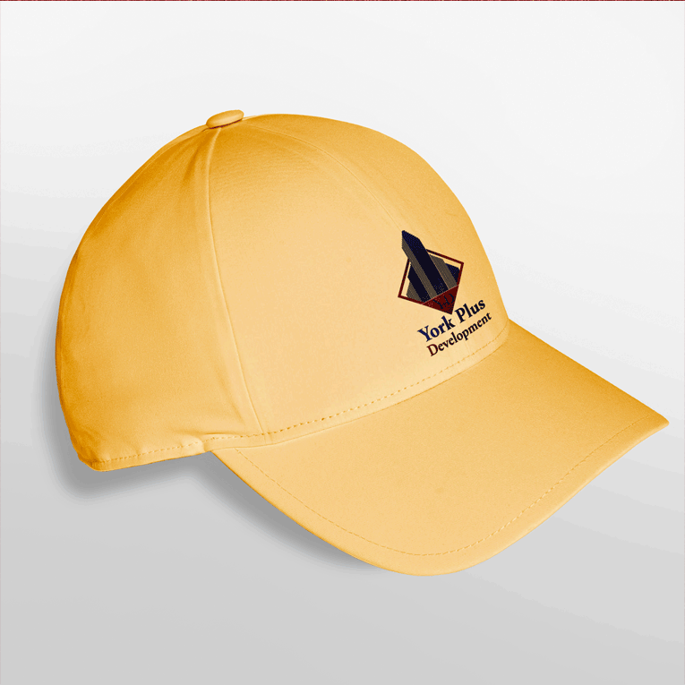
HAT / CAP
I am text block. Click edit button to change this text. Lorem ipsum dolor sit amet, consectetur adipiscing elit. Ut elit tellus, luctus nec ullamcorper mattis, pulvinar dapibus leo.
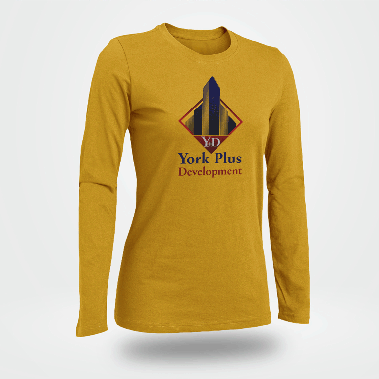
T-SHIRT
to change this text. Lorem ipsum dolor sit amet, consectetur adipiscing elit. Ut elit tellus, luctus nec ullamcorper mattis, pulvinar dapibus leo.
Stationeries Corporate Design
Integrated All Element
Everything Must be Integrated
We design great combination branding systems (visually) for the present company at the core of public vision. but that means most of the audition can remember and find the company easily the most important thing for a company is the trust of its client and we do it very strongly through our strategy.
